
Designing for the people behind
every delivery
GINTAA runs a city-wide delivery network through its on-ground partner ecosystem. The app supports everything from onboarding and order management to tracking and earnings. I worked on designing most of the mobile experience, with a strong focus on real operational workflows and how partners actually work day to day. What started as a delivery app evolved into a product that became part of the partners' everyday routine.
A delivery partner's day is constantly moving.
They check earnings between deliveries, accept tasks while on the go, and need to understand order details within seconds. The app had to do four things really well.
Onboarding without friction
Get new partners verified and ready to take their first order.
Glanceable tasks
Active orders readable in the few seconds between deliveries.
Trustworthy earnings
Clear answers to "how much did I make, and when do I get paid."
Discoverable benefits
Make incentives and perks easy to find without adding noise.
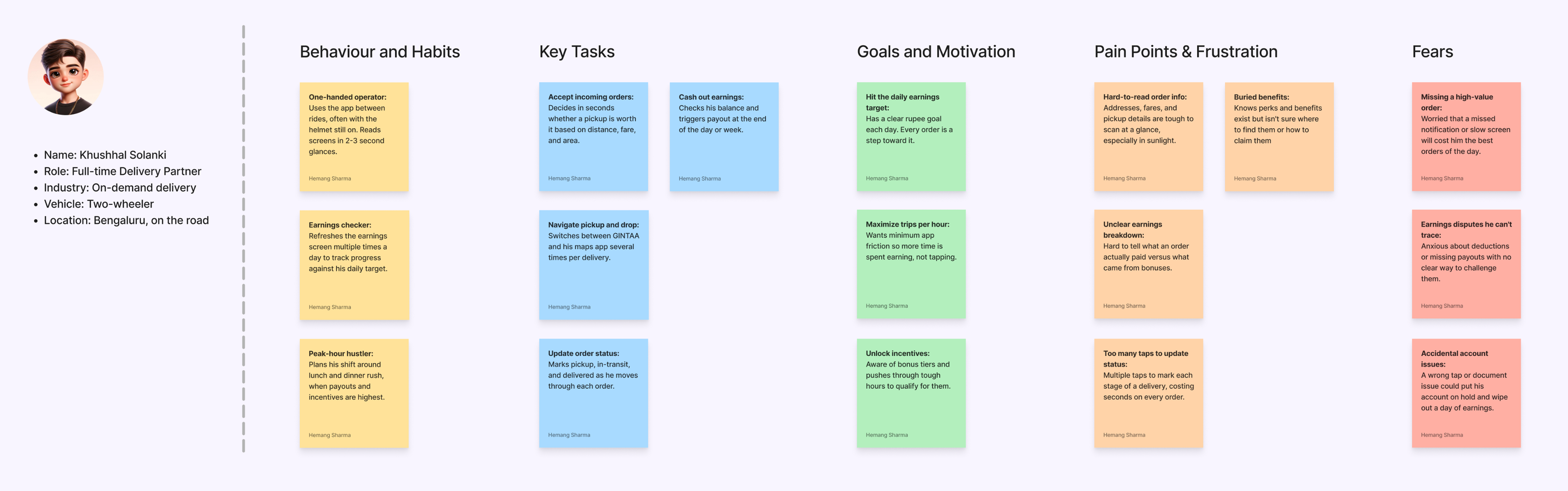
The partner we were really designing for.
Before any screens, I mapped the partner we were really designing for: a full-time rider who reads the app in two-to-three-second glances, helmet often still on. His habits, goals and fears shaped every later decision.
What I owned, and who I worked with.
A small team with clear scope. Most of my time went into the mobile app, with the admin portal running alongside it.
I worked closely with the GINTAA team and the Product Manager to understand the business and the brief. What the network looked like, how partners moved through the system, where things broke today.
From there I explored the partner experience to find the moments where small friction did the most damage. That shaped the design direction for both the mobile app and the supporting admin flows.
Through the build, I stayed involved with engineering to keep the final experience close to the design intent.
- ✓Mobile app, full end-to-end design Primary focus
- ✓Supporting admin flows Withheld · NDA
- ✓Working sessions with PM and team lead
- ✓Implementation reviews with engineering
- ✓56+ screens designed across the experience (including admin and mobile)
Three principles held the app together.
Most decisions came back to these. They were simple, but they kept the experience honest in the moments partners had the least attention.
Hierarchy first.
On most screens, one action or piece of information matters more than the rest. The layout surfaces that first; everything else falls in line behind it.
Glanceable, not dense.
Partners check the app for a few seconds at a time. Information had to land in that window without stripping out what they actually needed.
Familiar over clever.
Status, earnings and action patterns repeat across screens, so partners never re-learn the app moving between flows.
Four flows that shape the daily experience.
A walk-through of the parts that matter most. Each flow stays true to one design intent.
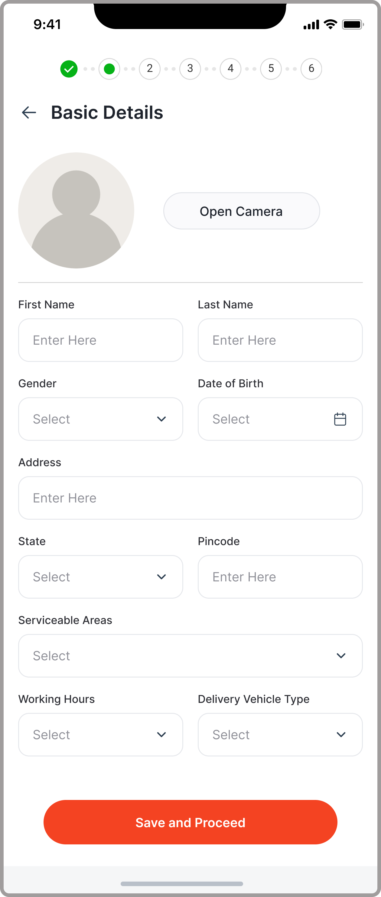
Onboarding
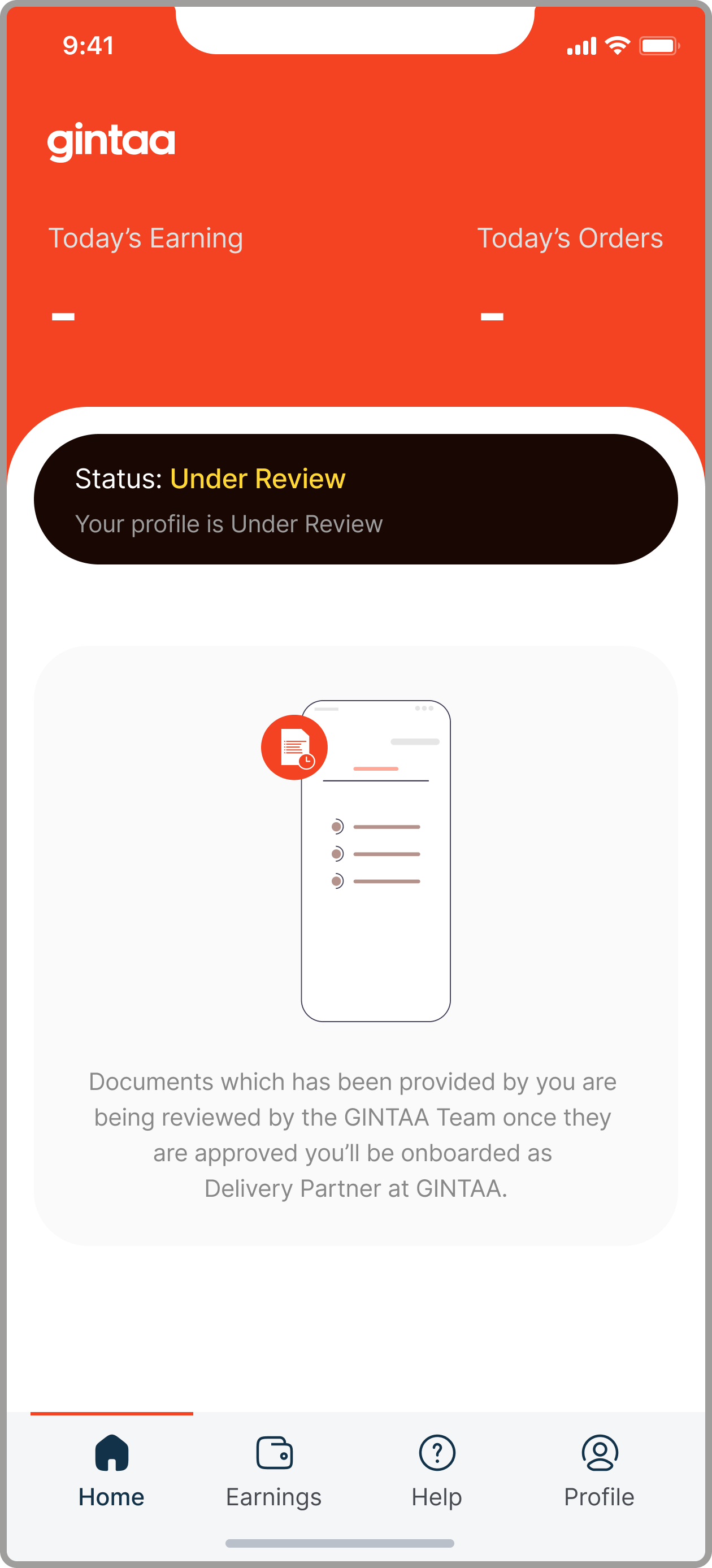
Verification and setup broken into smaller steps, so progress stays safe even if a partner drops off mid-flow and returns later. The goal was getting partners to their first task quickly, without the form feeling heavy.
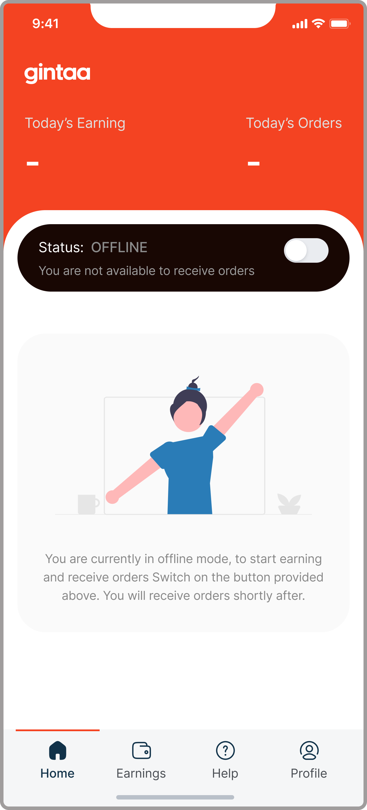
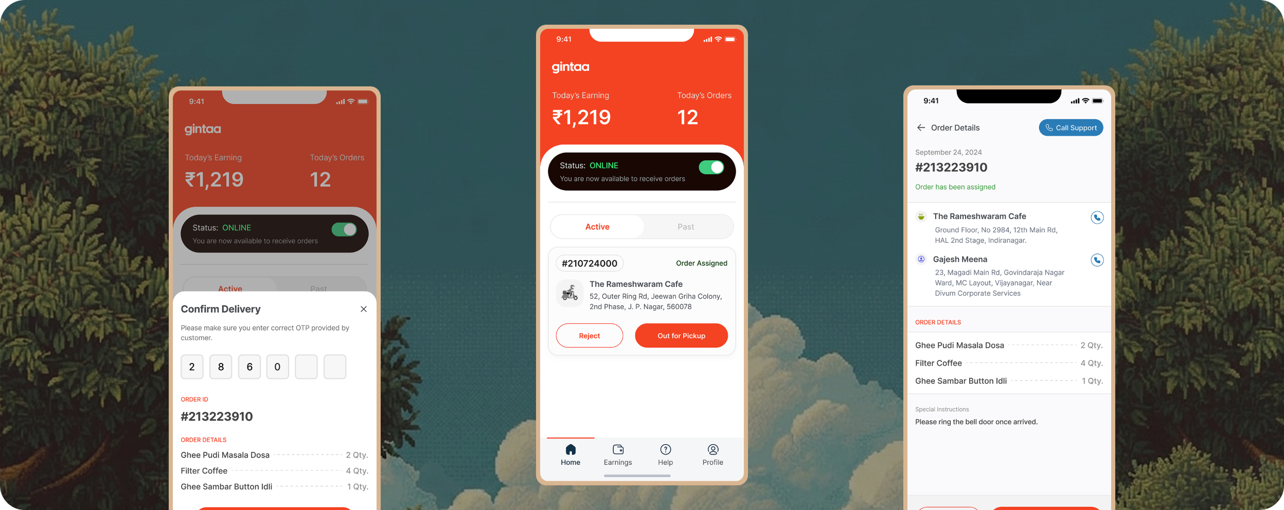
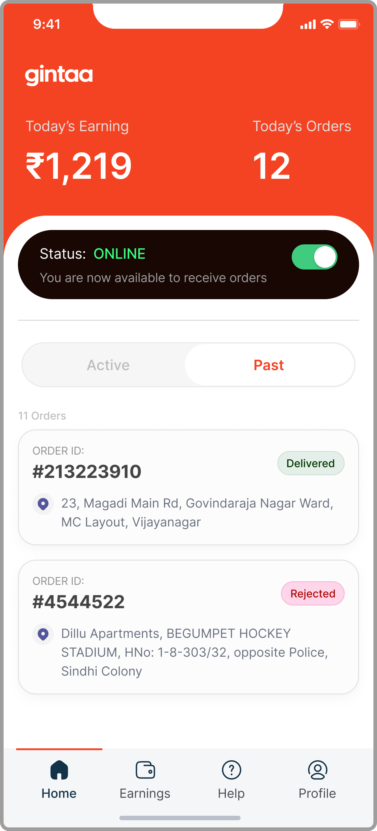
Task management
A scannable view of what needs attention next, ranked by what's active right now. Anything that wasn't immediately useful moved off the primary surface so the screen stayed easy to read.
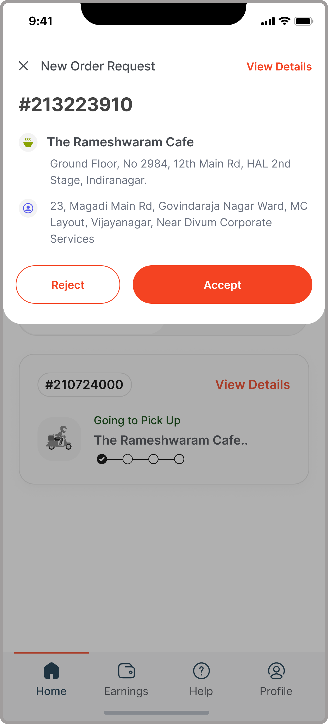

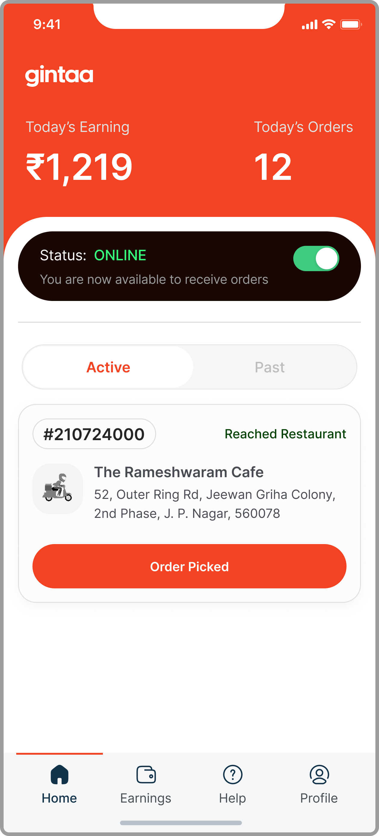
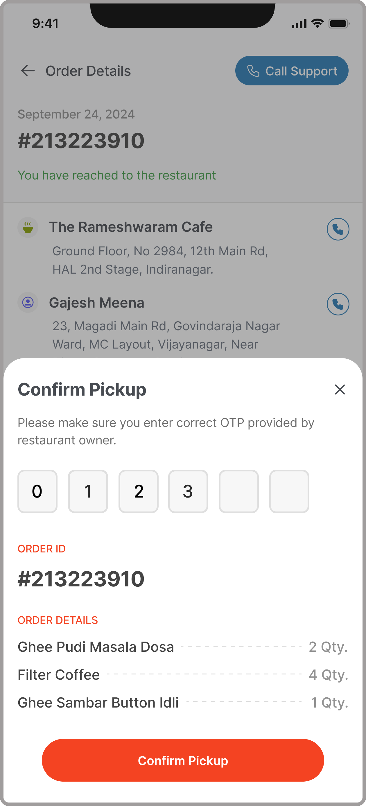
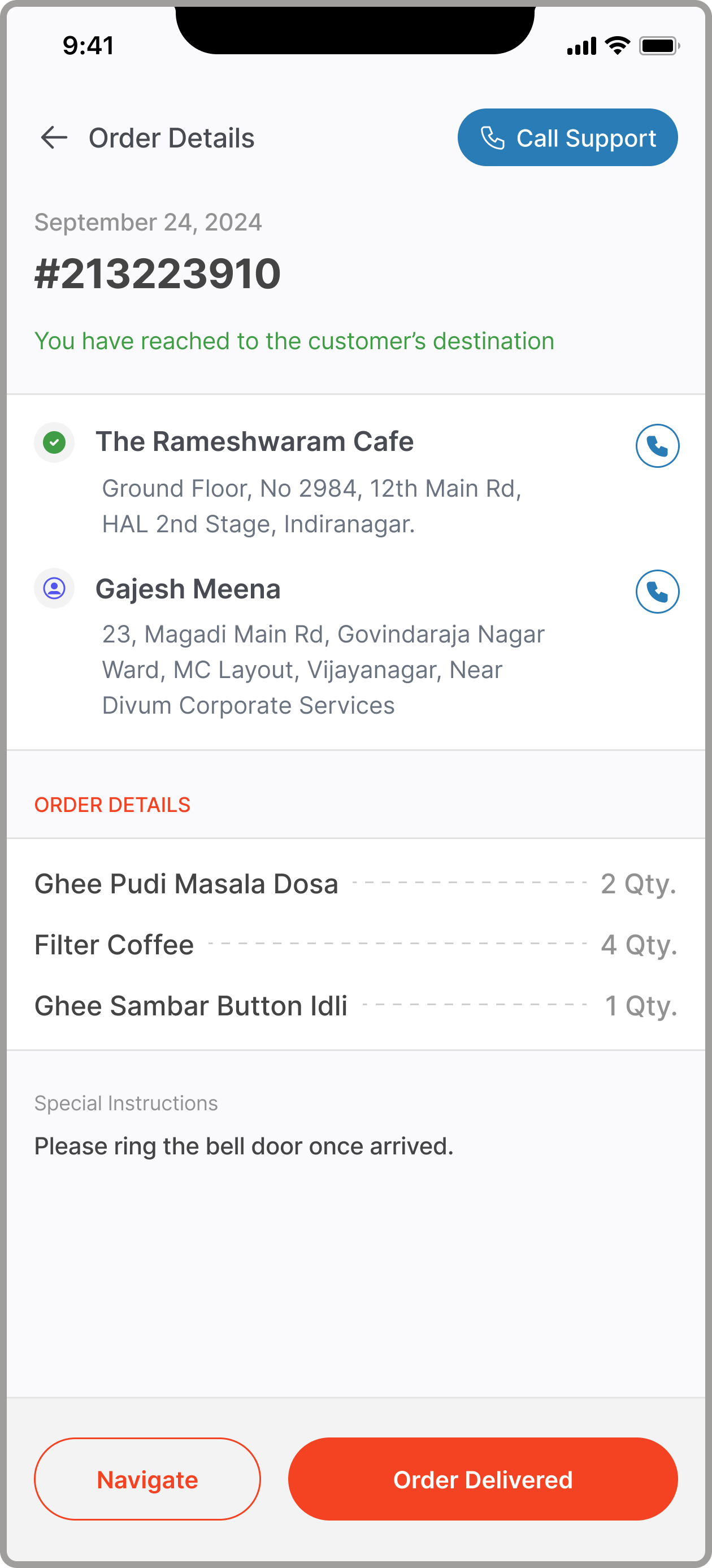
Order tracking
Pickup and drop details organised by what partners reach for first: the address, the unit number, the COD amount. Status pills reuse the same vocabulary across the app, so the screen needs no learning.
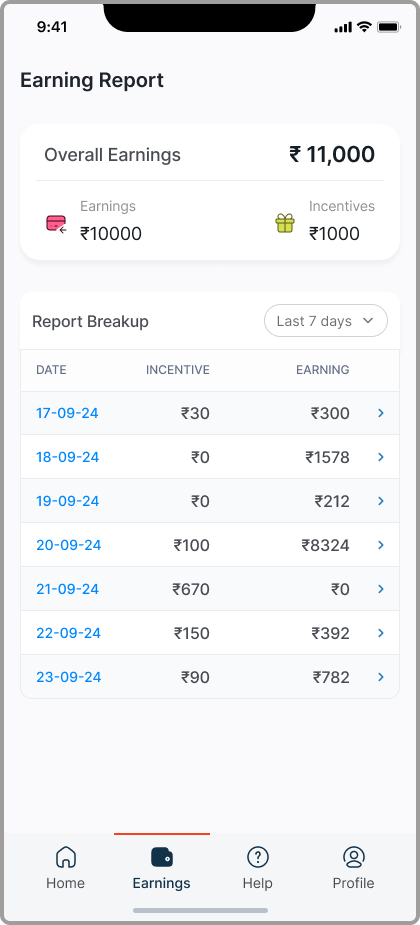
Earnings
One clear number first, today's earnings, then the breakdown underneath for partners who want to see how it adds up. Payout timelines stay visible so partners aren't guessing when the money lands.

Design held up through development.
The hand-off is where most design intent gets lost. So I treated implementation as part of the design, not the end of it.
Aligned early, often.
I worked with the PM and team lead to understand business requirements and how operations actually ran. That context shaped what got prioritised and what stayed simple, so decisions matched real operational needs, not assumed ones.
Stayed close to the build.
I reviewed builds, joined technical discussions, and refined designs when backend constraints affected the experience. The goal was that what shipped felt the same as what was designed, which doesn't happen on its own.
Live, in production, and in active use.
Shipping was the start, not the end. The work I'm most proud of is the part that doesn't show up in screenshots.
"The most valuable part of this project wasn't a specific screen. It was learning that good design holds its shape through development only when you stay involved. The hand-off is the easy part. The work after it is where it shows."
Selected work shown here. Happy to walk through the rest.
Some screens and flows aren't public due to confidentiality. I'm glad to walk through the full set in conversation.