PORTFOLIO © 2026
PRODUCT & UI/UX DESIGNER
0%
HEMANG SHARMA
View Resume
Back to projects
Enterprise Customer Experience Platform 2024

One customer, five teams,
one screen.

An internal Customer Experience Platform that brings orders, returns, projects, and escalations into a single connected view, so any team at Bosch can step into a customer conversation with the full picture. Designed end to end as a concept, from journey mapping with the business team through to the final interface.

Bosch CXP dashboard concept: customer overview with milestone progress, fulfilment and returns metrics, and accounts that need attention, over a pixel-art forest backdroprt forest backdrop">
Role
UI/UX Designer
Team
Solo designer
Duration
1 month
Stage
Ideation & Concept
The Problem

Five teams, five tools, one customer in the middle.

Bosch's customer interactions are naturally complex. Sales, quality, engineering, logistics, and finance all touch the same accounts, but they don't see the same picture.

CUSTOMER no shared view SALES (CRM) ENGINEERING (PLM) LOGISTICS (SAP) QUALITY (QMS) FINANCE (ERP)
Signal 01

No single view of the customer

Different teams worked in different systems. Even the people serving the same account were looking at different versions of it.

Signal 02

Conversations got lost between teams

Communications were hard to track once they moved across functions. Important context disappeared in the handover.

Signal 03

Escalations landed at the wrong door

Without shared visibility, escalations often reached the wrong point of contact, costing time and trust.

The cost

Lower satisfaction. Missed opportunities. Slower response times. All tracing back to the same root: nobody had the full picture in one place.

The Guiding Principle
The 30-second rule

What does someone at Bosch need to know in the next 30 seconds to help this customer?

Mapping the existing journey with the Business Development team, one moment kept coming up: even senior leaders struggled to grasp a customer's context when the account manager wasn't around. That observation became the question every screen had to answer.

Research & Strategy

How I scoped the work.

Two parallel tracks shaped the early thinking: understanding real workflows, and planning the product across more than one phase.

Two parallel tracks
Track 01 · Discovery

Walking the journey with the BD team.

I worked alongside Business Development to map the existing customer journey end to end, walking through real account scenarios, not abstract user flows.

The most useful sessions weren't about what data the system needed to show. They were about which signals actually influenced decisions in a live conversation.

Track 02 · Strategy

Designed for two phases, not one.

Phase 1 focused on internal Bosch users, the teams who felt the information gaps most directly. Phase 2 was scoped to extend the same experience outward to customers themselves.

That meant the design had to be flexible enough to face both directions without being rebuilt for either.

Built to roll out in two phases
Phase 01 · Active

Internal — clarity for Bosch teams.

Bring orders, returns, projects, escalations, and interactions into one place for sales, quality, engineering, logistics, and finance.

Phase 02 · Planned

External — extend to the customer.

Open a connected view back to the customer side, building on the same foundations established in Phase 1.

The Design

Four decisions that shaped CXP.

Each one came back to the 30-second rule: surface what matters, hide what doesn't, never make someone hunt for context.

Decision 01

A landing view designed for attention, not navigation.

The dashboard surfaces milestone progress, fulfilment, returns, and collaboration insights at a glance, while flagging which customers need attention right now, so users land on signal, not a menu.

CXP dashboard landing view: milestone progress, fulfilment and returns metrics, and a panel of customers that need attention right now
Decision 02

One customer, one screen.

Selecting an account opens a tabbed view where metrics, returns, projects, orders, opportunities, payments, and support details all live in one connected place, organised, not crowded.

Customer detail view with tabs for metrics, orders, returns, projects, payments and support — all on one connected screen
Decision 03

Status that tells a story.

For orders and returns, the timeline doesn't just show stages. It highlights delays, explains why they happened, and surfaces who's responsible. The context comes with the status.

Order and return status timeline that highlights a delayed stage, explains why it happened, and names who is responsible
Decision 04

Two layouts, one experience.

For the customer detail view, I explored both a structured tab-based metric layout and a card-driven visual one, testing how the experience scales as accounts get larger and information gets denser.

Two explorations of the customer detail view side by side: a structured tab-based metric layout and a card-driven visual layout
A Closer Look

When a status update needs to do more than show a status.

Most return and order timelines only tell you where something is. CXP's timeline tells you whether the journey is on track, where it's stuck, and who can move it forward, all without leaving the screen.

CXP order status timeline: Request received, Return sales order created, Quality approval, then a Dispatched stage flagged 5 days over SLA with a follow-up action and the owner named, and a pending Part received stage
Why this works · 01
Delay is shown, not buried.

The over-SLA stage gets a colour change, a clear time-vs-target read-out, and a specific action, not a generic warning.

Why this works · 02
Accountability has a name.

Every stage shows who owns it. When something stalls, the next action, "Follow up with Divyansh", is one click, not a search.

Why this works · 03
Context comes with the status.

Each stage carries its own short description so users understand why it exists, not just that it happened.

Working with the business team
Designed around real decisions, not assumed ones

"Before moving into design, I spent time with stakeholders across sales, quality, and operations, not just to understand what data needed to be shown, but to find out which metrics actually influenced decisions. That distinction shaped everything from the dashboard down to individual customer profiles, and it kept the experience grounded in real workflows rather than guesswork."

Impact & Outlook

From owned by one team, to shared across them.

CXP is concept-stage today. What it represents, and the shift it sets up, matters more than any single screen.

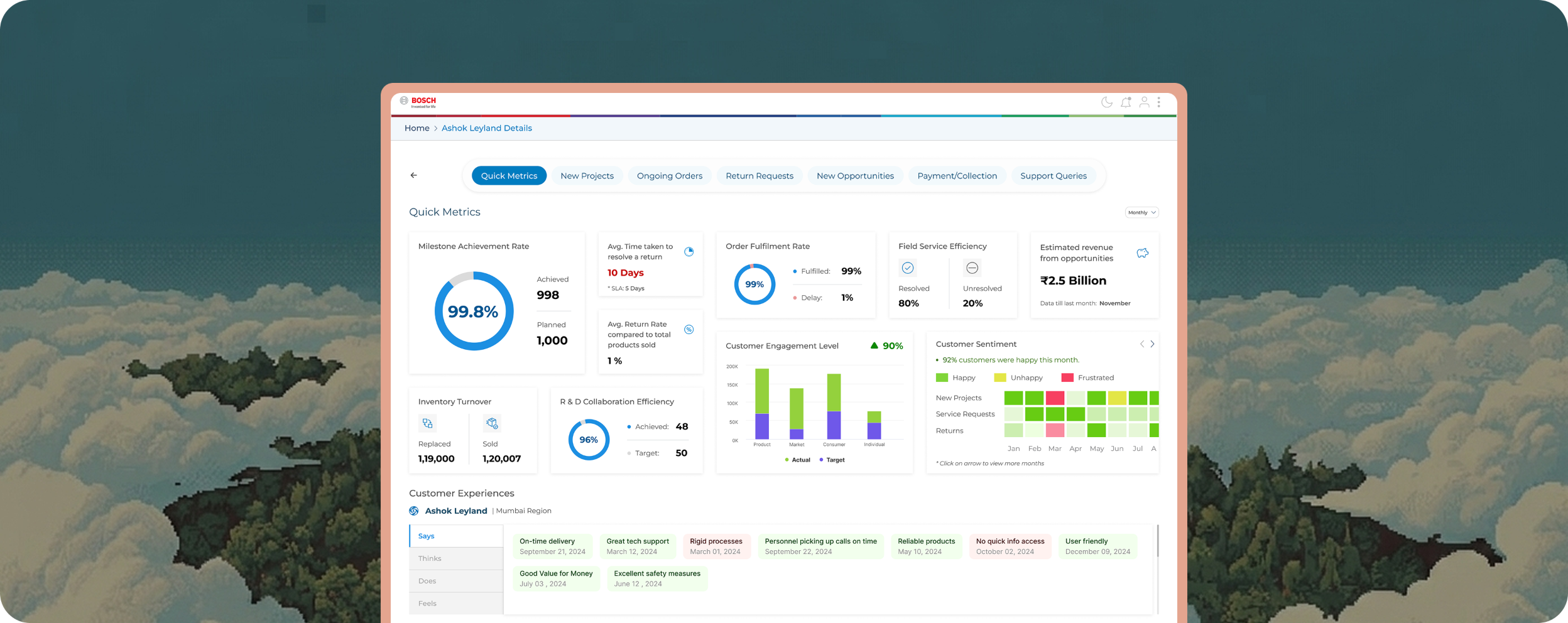
The most important thing the design did was reframe customer experience as a layer the whole organisation contributes to, rather than something held by a single account manager. Anyone, whether they regularly manage an account or not, should be able to step into a conversation with confidence in under a minute.

The rollout begins with the internal teams that experience the information gaps most directly, then expands outward. The foundations were built so Phase 2 doesn't require starting over.

Goal
Customer context in under a minute.

Anyone at Bosch, regardless of how often they touch an account.

Shift
From one-owner to a shared layer.

Different functions can access, trust, and contribute together.

Next
Foundations ready for Phase 2.

The same architecture extends outward to customers themselves.

Selected work shown here. Happy to walk through the rest.

Some screens and workflows aren't public due to confidentiality. Happy to share the full set in conversation.

Next project